We recently released new layout guidelines to aid with designing applications and plasmoids. So I wanted to provide a quick example of how to use the guidelines to design the layout for an imaginary calendar application.
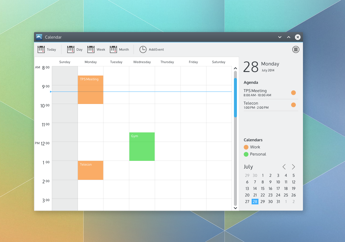 |
| A quick design for an imaginary calendar app |
To choose an application layout, the new guidelines encourage awareness of the functions and commands provided by your application as well as the structure of the content provided by your application.
So let's start with commands. Suppose we want the primary function of our calendar application to be providing a daily, weekly or monthly schedule of the user's upcoming work or personal events. The user, Sue, would also like to be able to add events to her schedule. There are many other functions for a calendar application that I'm sure we're all aware of. We're not designing in a vacuum - there are many calendar applications from within KDE and elsewhere from which to draw inspiration. For the sake of this example though, lets start with the described functions and commands.
The guidelines suggest layout patterns for simple, complex and very complex command structures. So where does our calendar app fit? Well, I wasn't quite sure either. And that's ok! Some things are tough to know until you start delving into the design work. The guidelines suggest starting with a pattern for a simple command structure when you're not sure. So that's what I did. As I started putting together a design and thinking about how Sue would use it for the purposes described, it became clear that not only were there several other desirable functions (like switching calendars, setting up calendar accounts, setting calendar colors, and more) but there are also certain commands Sue might use quite often (like switching between a day, week and month view of her schedule, adding an event and quickly getting back to today after browsing forward or back in time). So I settled on the suggested Toolbar + Menu Button command pattern for a complex command structure.
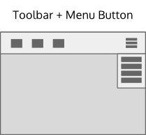
The mockup toolkit provides an example:

The content structure for a calendar is pretty much flat: Just a collection of days (with or without events). I wanted to show a single day view, a week view(7 days) or month view (28 - 31 days) as well as properties related to the current view or selection like the date, the agenda for the current day or view and the active calendars. So I settled on a Selection-Properties navigation pattern from the recommended patterns for a flat content structure

The mockup toolkit provides an example of a Selection-Properties navigation pattern combined with a Toolbar+Menu Button.

Now I have a basic layout I can use for the rest of the design work. I put what I think will be the most frequently used commands on the toolbar - Today, Day, Week and Month views as well as a command to add an event.
Many of the other commands like setting up calendar accounts and the like are exposed through the menu button. I design a week view using the recommended design color set and occasionally checking the typography guidelines. For the properties panel. I draw some inspiration of Sebastian Kügler's great design work on the new clock plasmoid panel popup for the current date to achieve some additional visual consistency with the desktop. I also decided to add a mini month view for convenience and a legend for the active calendars (possibly directly editable?).


Put it all together and we have a quick design for an imaginary calendar application.

It's not a complete design in any sense of the word - icons, day and month views aren't shown, nor are calendar settings and the like. But it's probably enough to, for example, start a review on the VDG forums to get feedback from our fellow intrepid designers, the usability team and/or potential developers.
Just to be clear, you still have to design. Design is a creative activity. While guidelines can provide a sandbox, it still requires creativity within that sandbox. Often that means that the best way is to just start and figure it out as you go. For me, that's usually a bumpy trial and error process which I simply accept rather than agonize about. And no, you're not allowed to declare that you're not creative! :-)
Always feel free to ask for help or feedback on the VDG forums - it's a great place for us to learn together. This design was done using the mockup toolkit, but just use whatever tool you're comfortable with, including just sketching on paper and taking a picture of it. Don't wait. Don't hesitate. Just do. The long term hope is that these new layout guidelines will provide enough flexibility to create layouts suitable across the full spectrum of KDE applications while also helping to achieve layout consistency where it makes actually sense. Like all guidelines, it is a living document which we'll update collaboratively over time. We'll also do more examples like this in the future.
Hope this helps!
These guidelines make for a great starting point, and I think you could argue it covers most of the common application types we see. It's good to be making room for the more complex applications rather than putting up any artifical, unhelpful constraints, as KDE is known to have quite a few featureful programs. Even still, there's plenty of simplification and consistency we can achieve without neutering applications, and these guidelines give a lot of breathing room from what I can see.
SvaraRaderaI really like where this is going.
My hope is that someday we'll get rid of the typical KDE boxes-inside-boxes-inside-boxes look. The mockup shows a very nice direction!
SvaraRaderaDo you really believe KDE Apps can be like that? Amazingly nice looking. The realistic KDE design would be cramming 50 more icon/tabs on that same screen and adding 100 options.
SvaraRaderaI was thinking, "it will be super amazing if korganizer looked like that in its week view." Pretty good
SvaraRaderaWhy, oh why there needs to be again one of the worst usability feature as menu button on right side of the toolbar?
SvaraRaderaBecause Google added that to Chrome, everyone else needs to jump off the cliff as well?
Now there is always one forced widget requiring a whole top toolbar to exist. Screaming just "Why!?".
The menu button is optional. It'll simply be enabled by default. When you disable it a normal menu bar will be shown again, similar to how Dolphin handles it. :)
Radera
SvaraRaderaThank You for sharing such an informative post. I like the way you present the things and make the post more presentable. At PegaLogics, You will get the best industry-leading experience in the field of Mobile App Development & Web Designing. Visit our website, Regards.